Email newsletters are an important way to establish and grow relationships with your clients. To do that , the newsletter needs to be an enjoyable experience that is informative and maintains branding standards.
On this page you will find information on how to visually create an effective newsletter that meets both of those goals.
As always the marketing team is here to support you if you have any questions, issues, or even need to work directly with us to create a newsletter template or specific images. While this page specifically addresses the visual aspect of email newsletters, if you would like advice for content creation, understanding metrics or anything else, we can provide that as well.
1. Maintain consistent branding
First and foremost it is important for SBDC locations to maintain consistent branding in everything we send out. This helps ensure that everything we do looks professional and cohesive.
We aim for a clean, modern look with lots of white space and geometric shapes.The branding style guide is posted below. Please download and review.
Additional points of reference
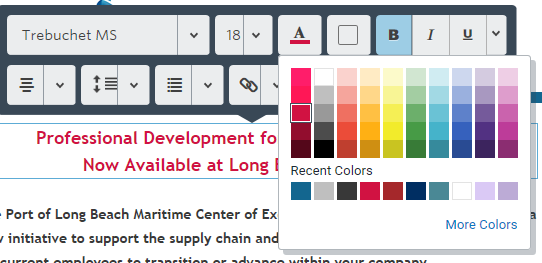
- Focus on sticking to the specific hex color listed in the guide. These can be input by selecting More Colors in the text color selection menu. From there you can type in the hex codes in the box provided.
- red (hex: #d11242)
- blue (hex: #002e62)
- grey (hex: #adafb2)
- The typefaces we use for branding are not available in Constant Contact. The best substitute is: Trebuchet MS.
2. Make sure your newsletter is mobile-friendly.
Most people tend to read their email on their phones, so it is important that they are able have a good experience viewing your emails or they will unsubscribe/ignore them in the future.
Testing your newsletter is a crucial step for each version of the newsletter you send. To see how it will look on a phone or tablet when building your letter in Constant Contact:
- Select Check & Preview
- Select Preview
- Click on the Mobile View tab
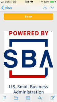
Often a newsletter or website will look great on a computer but when switched to mobile things will become clunky/confusing/not aligned/not resized properly. We see this a lot with center/sbdc/sba logos which will take up the entire screen in mobile view (see example image at right).
Additional tips:
- Send a test email to yourself and open it on your phone.
- Send a test newsletter to the marketing director to review (please notify the director directly when doing so).
3. Using images
- Images should not be blurry.
- When listing several workshops in an email, the preview images should be the same size.
- Do not use images for backgrounds. Only use solid colors or patterns that use our branding colors and do not steal attention away from the content. (See examples below)
- Use an engaging header image that includes the center name. We have created some already for each center which can be located here. If you would like edits made to these please reach out to the marketing team via the hub.
- We have collected stock photos to be used for marketing purposes here. Feel free to use these for your emails and workshop photos.
- To find your own images, we have compiled a list of stock-photo resources where you can search for images that are free for commercial use.
- If you need us to create specific images for your newsletter, please submit a request through the hub. These have a 2-3 day turn-around time so please plan ahead.


Example Newsletters
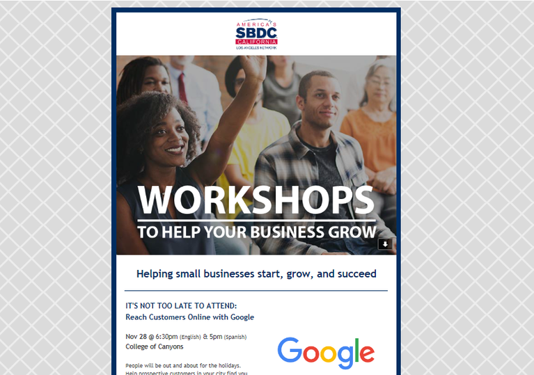
Example 1:
- The SBDC logo at the very top of the email
- The large header image.
- The pattern background
- The clean minimalist look
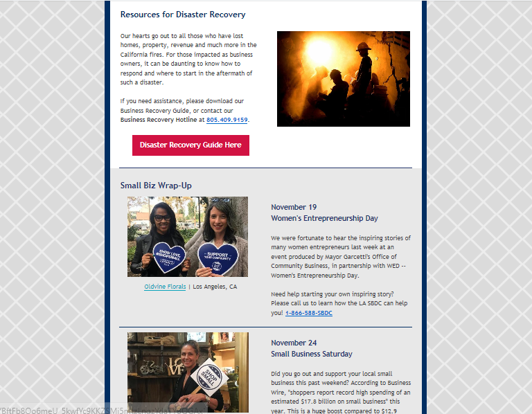
Example 2:
- The use of branding colors, specifically the use of ref for the call to action button
- The consistent image sizes
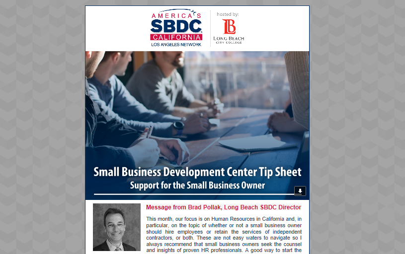
Example 3:
- This newsletter is similar to the examples above, while still being a little different. Newsletters do not all need to be exactly the same, but following the guidelines and examples can help you create items that look cohesive without being exactly the same.